Streamlining Device Updates
UX Design & Research
FORT Robotics is an automation company that helps reduce risk in the agricultural and construction communities through smart devices. These can be attached to vehicles and then controlled via remote. To ensure users have the best and most compatible experience with their device, the front-end development team and I designed a web application for users to easily manage and update their devices.
Project goal & objective
Users often lose control of their machines or are unable to pair their devices simply because of outdated firmware on their devices. This leads to accidents in the work field, which creates a poor user experience as well as reflects poorly on the company’s mission statement. FORT Robotics needed a way to drive awareness of device updates and streamline the process for users to complete an update. The goal of this effort was to reduce the number of outdated devices and in turn improve user satisfaction with our products.
My role & design process
I was tasked with creating a design solution that helps users become more aware of new updates. I started by conducting competitive research; I looked into other robotics companies that have similar concepts to gain inspiration as well as compile screenshots into a UX moodboard of their solutions.
Once I did that, I created a series of wireframes. From those wireframes, I conducted a design critique with the team leads and the other designers and took their feedback to tweak and create my first set of mocks.
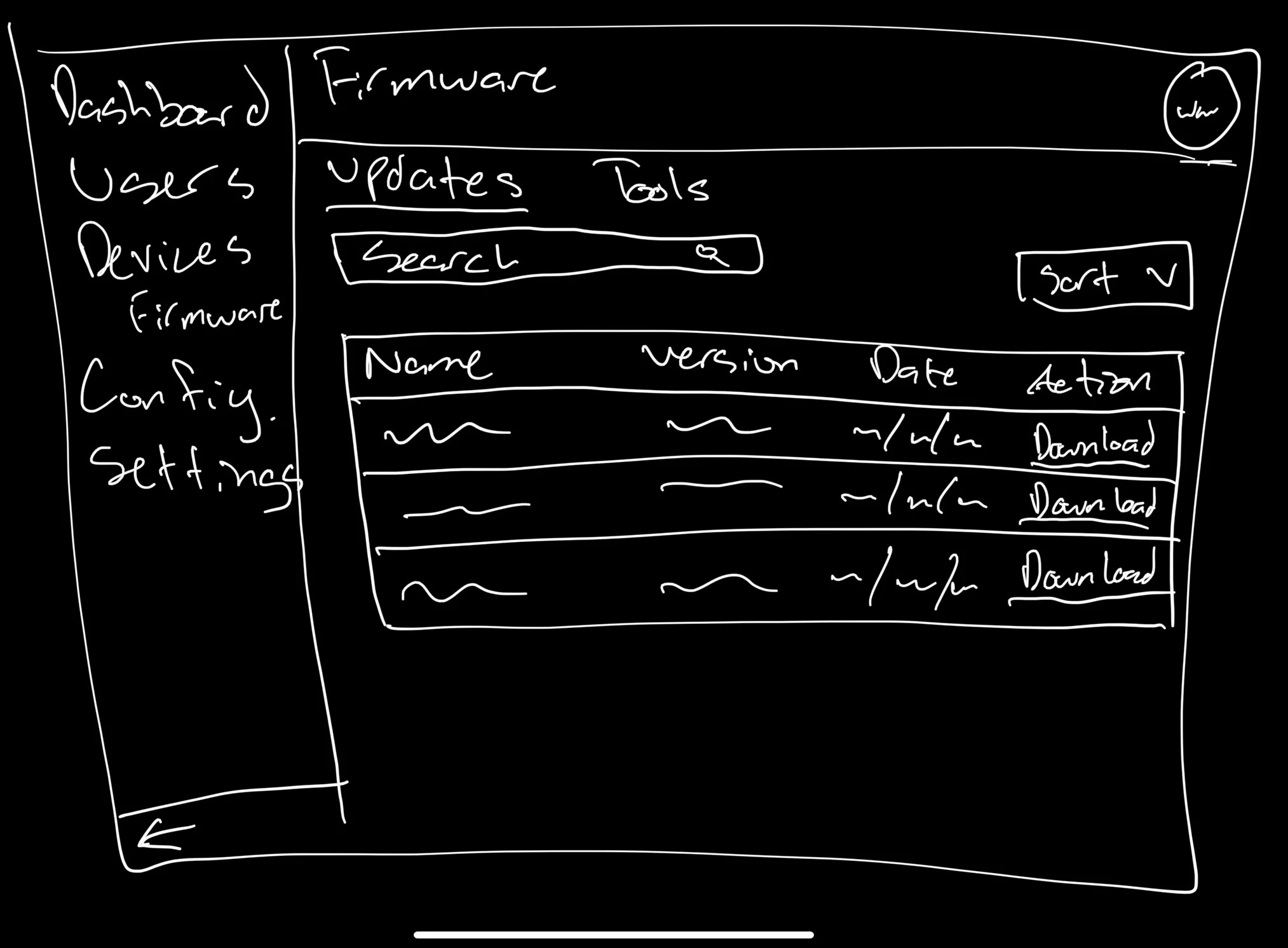
I started off by creating a sketch of a table that shows the different firmware updates. I modeled this after FORT’s existing sites in order to maintain visual consistency. Next I created wireframes that show what it would look like when users try to sort/search through this table.
The next step in my process was to show the different variants that display the tool/instructions users needed in order to update their devices.
Lastly, I made sure my designs were responsive across different device types and built my mocks to include versions for desktop, tablet, and mobile. These final designs were presented to leadership to get them approved for development.
The final design shows a table that has all the updates for the different types of devices that FORT has that the user can download. Underneath the table, there’s a card that provides users with the ability to update their device or read update instructions. Above the table, the user can filter the contents by Name and Date or make a specific search for what they want.
Feedback & findings
Further simplifying my designs
After showing designs that showed two cards, the team leads wanted to combine both cards into one to simplify the page.
Initially, I thought having these cards should be kept separate since they contain different actions. However, having all the information on one card creates less for users to parse and focuses the user’s attention more on the list of existing device status.
Reflections
Areas of improvement:
After spending time creating designs that were geared toward one direction, my team leads decided to change directions completely. From this, I learned to:
Be flexible. Design direction changed a lot during this project and I learned to adapt and be ready to shift gears entirely.
Trust yourself more with your designs.
Don’t be afraid to ask for help. The other designers have lots of experience and are happy to help with problems I might encounter.
I think if I were to do this again I would be more quick to reach out and ask other designers for feedback. That way, I could make the most of my time and flush out more ideas.
Final designs are shown above on desktop, tablet, and mobile.


