Commercial Auto First Notice of Loss (FNOL)
UX Design & Research
Berkley Technology Services (BTS) is an IT solutions provider under W.R. Berkley Corporation, an insurance agency for businesses and high value assets. BTS offers software that boosts productivity and profit, along with help desk support and database system connectivity.
During my time at BTS, I designed for multiple business lines, including Commercial Auto, Commercial Property, and General Liability.
This project focuses on the Commercial Auto line of business.
Project Goal & Objective
The insured user needs a streamlined way to report a vehicle accident to Berkley for coverage, and Berkley must efficiently communicate policy details to the user. Without this process, the insured would have no way to access coverage from their insurance policy and would need to pay out of pocket.
The existing page (shown to the right) uses a generic text-box format, which overwhelms users with the amount of information they must provide.
After meeting with my team and members of the claims department to define each step of the flow, I created a user flow to organize them effectively. We decided to break some of the original steps down into smaller steps so that the user could feel as though they were being guided through a process rather than having to see everything at once.
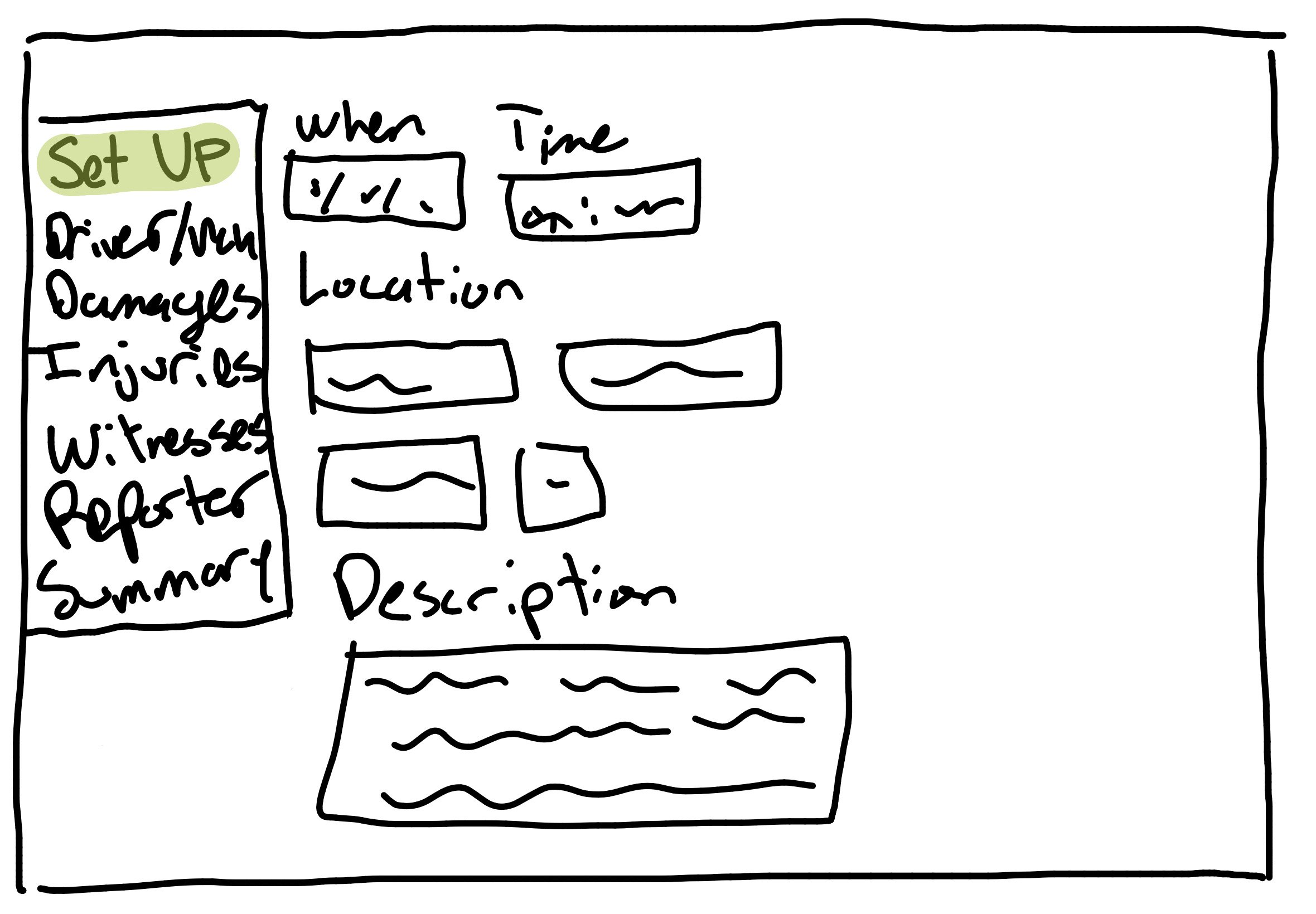
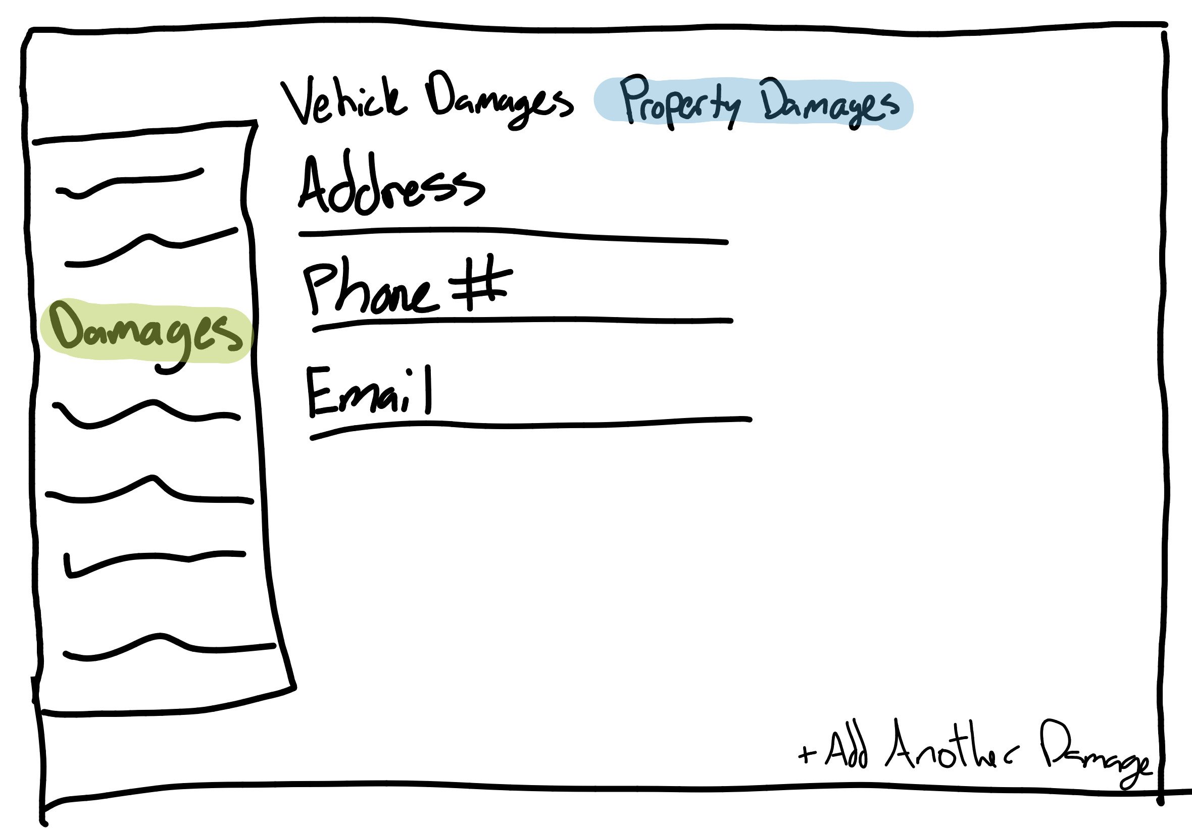
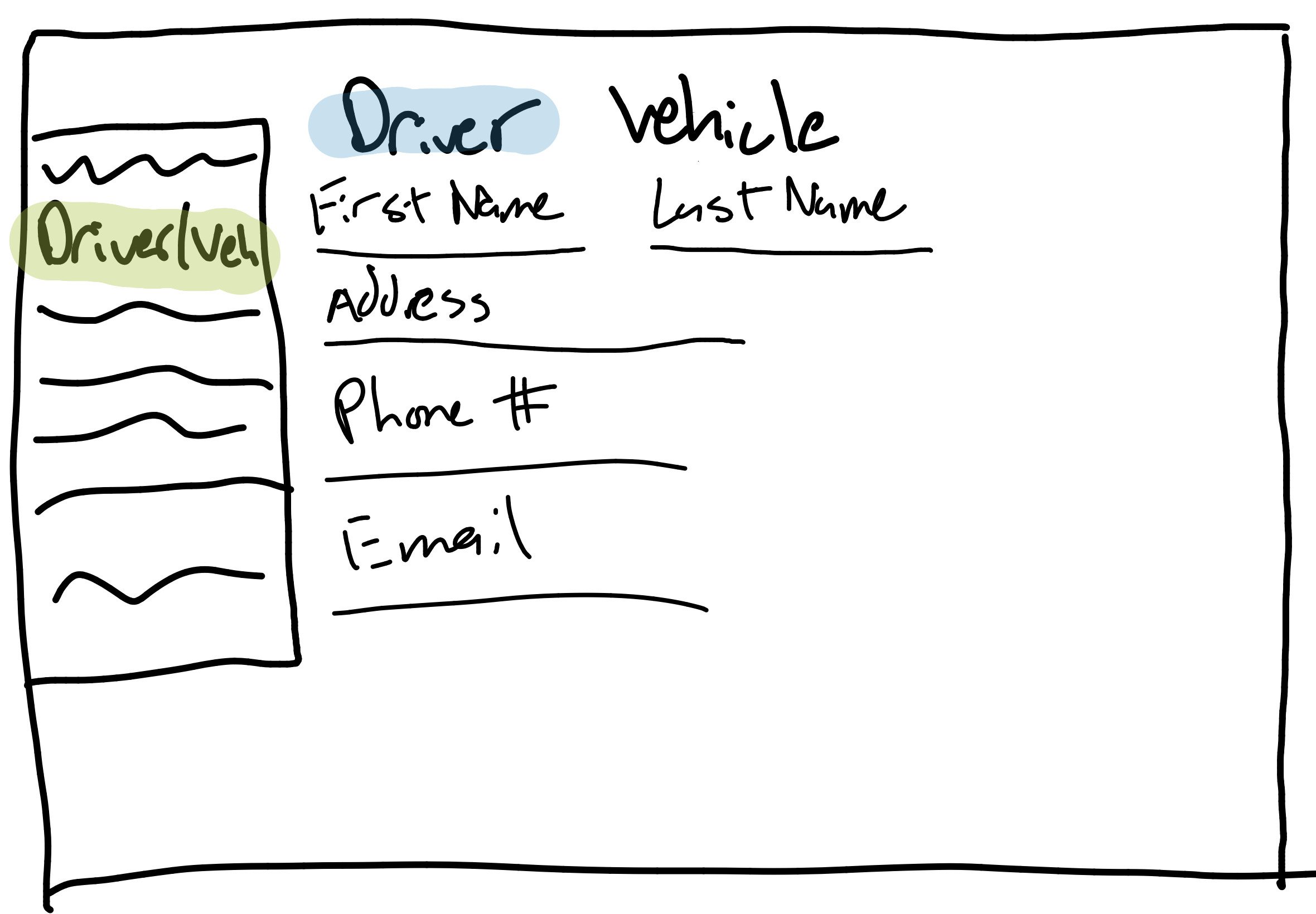
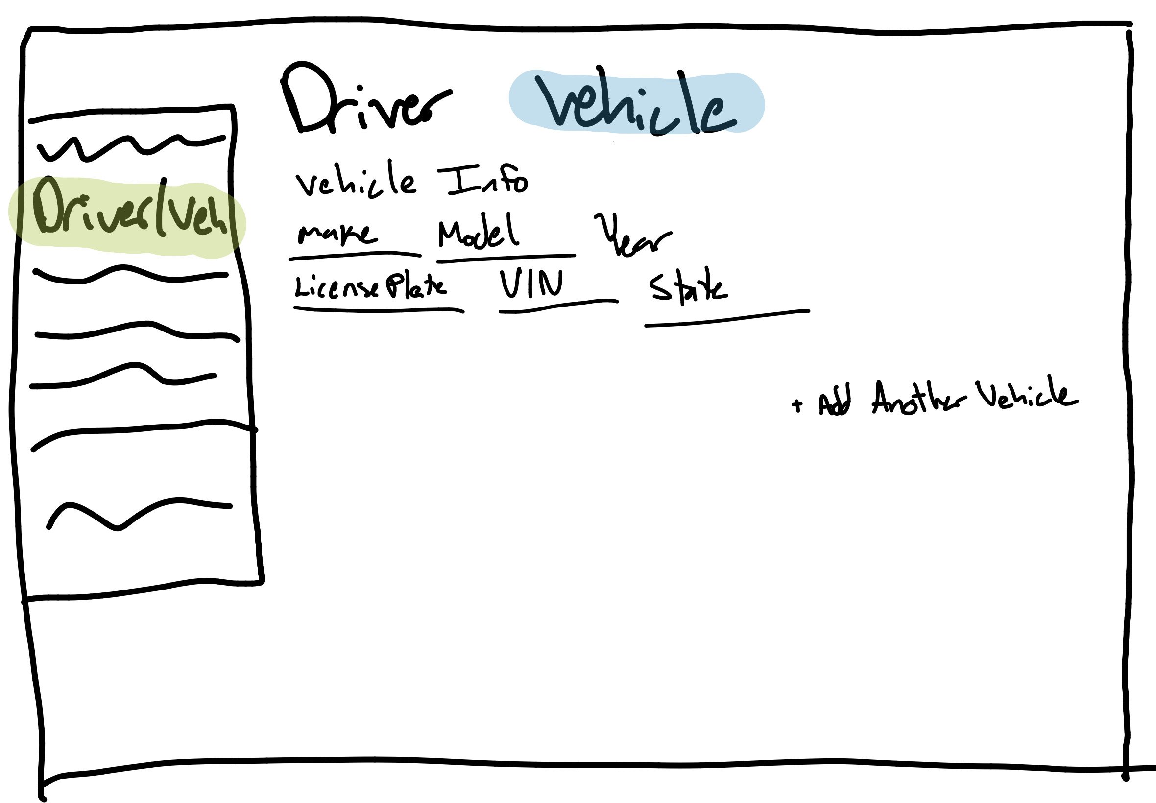
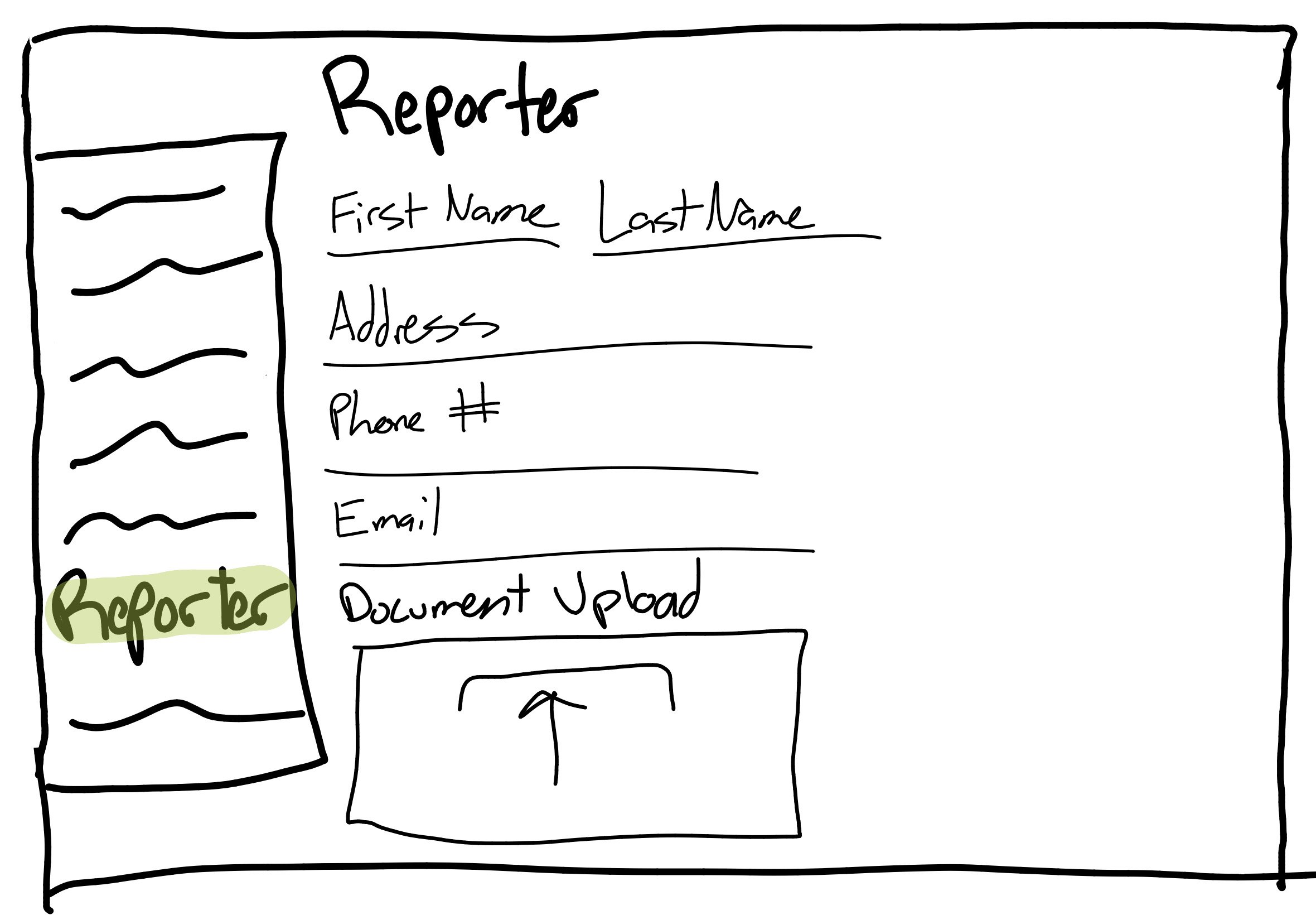
After further meetings with my team about what information belongs under each step of the flow, I drew some sketches for them. My initial idea was to have the progress bar on the side of each screen so that the user could track where they were at in the flow as well as go back to any completed step if needed.
My Designs
I used a color scheme based on a flow from another BTS branch to maintain consistency.
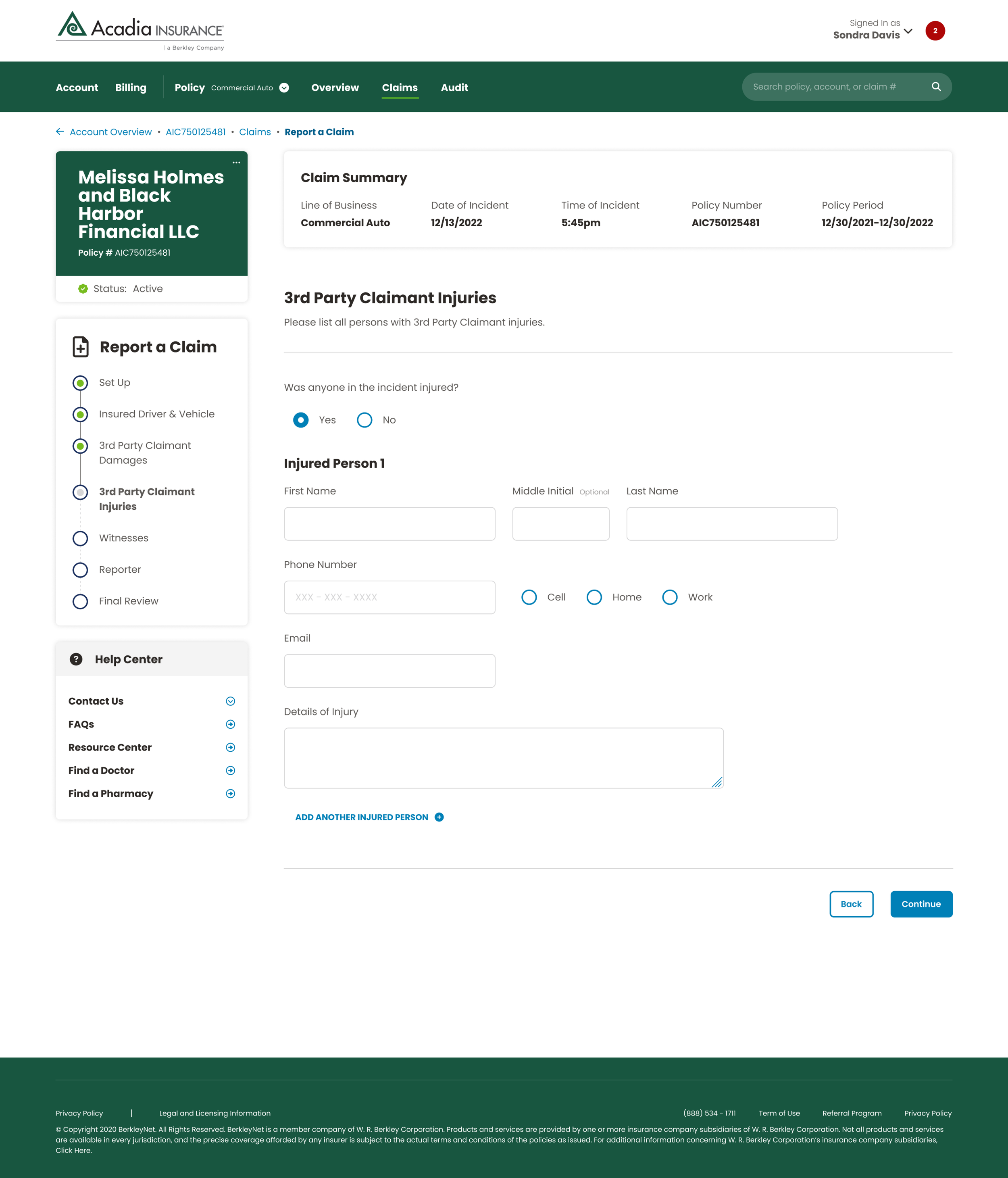
To make the new flow represent the company as it is today, I added sidebar elements that would help the user understand where they are at in their process. I’ve highlighted them below:
Final Designs
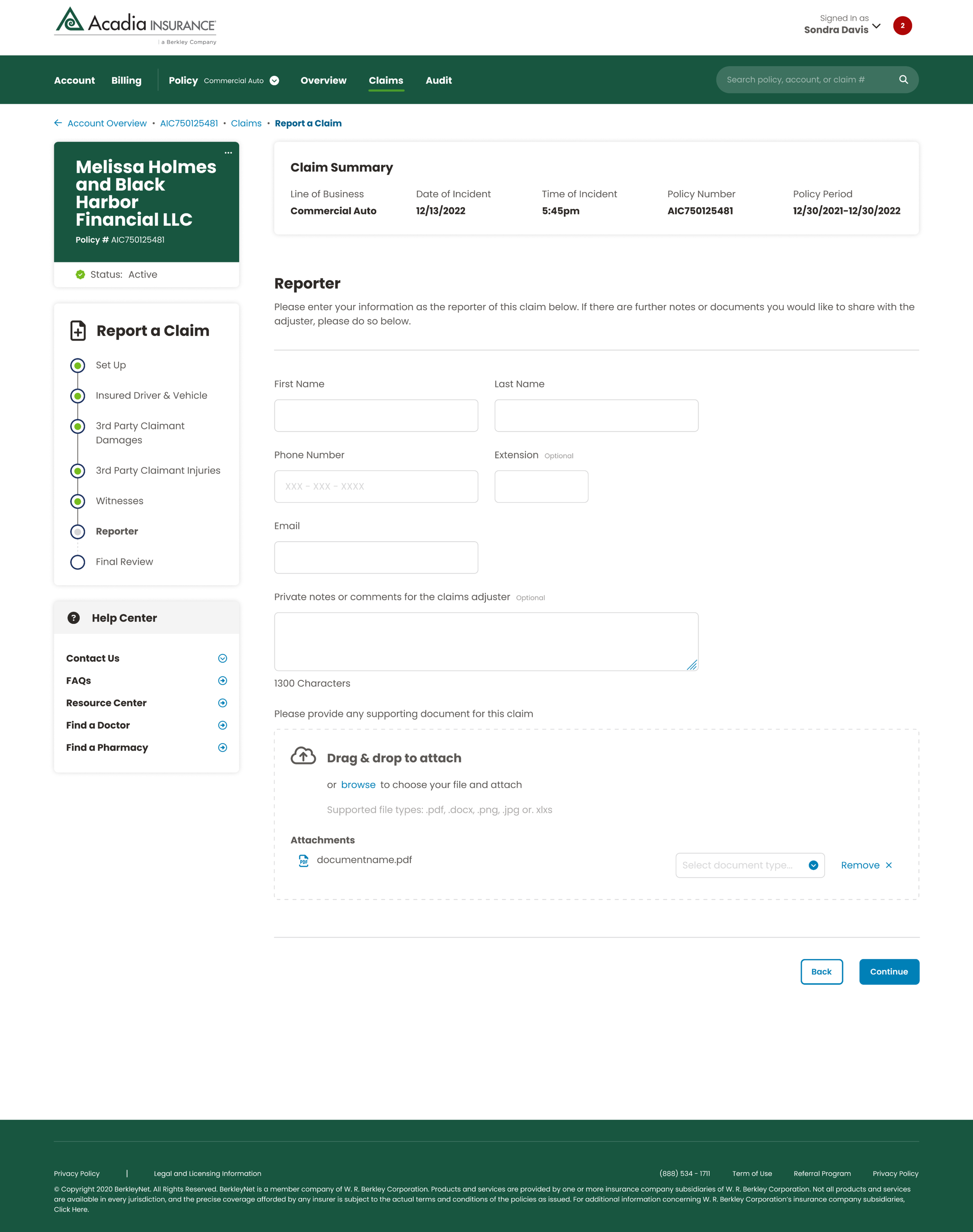
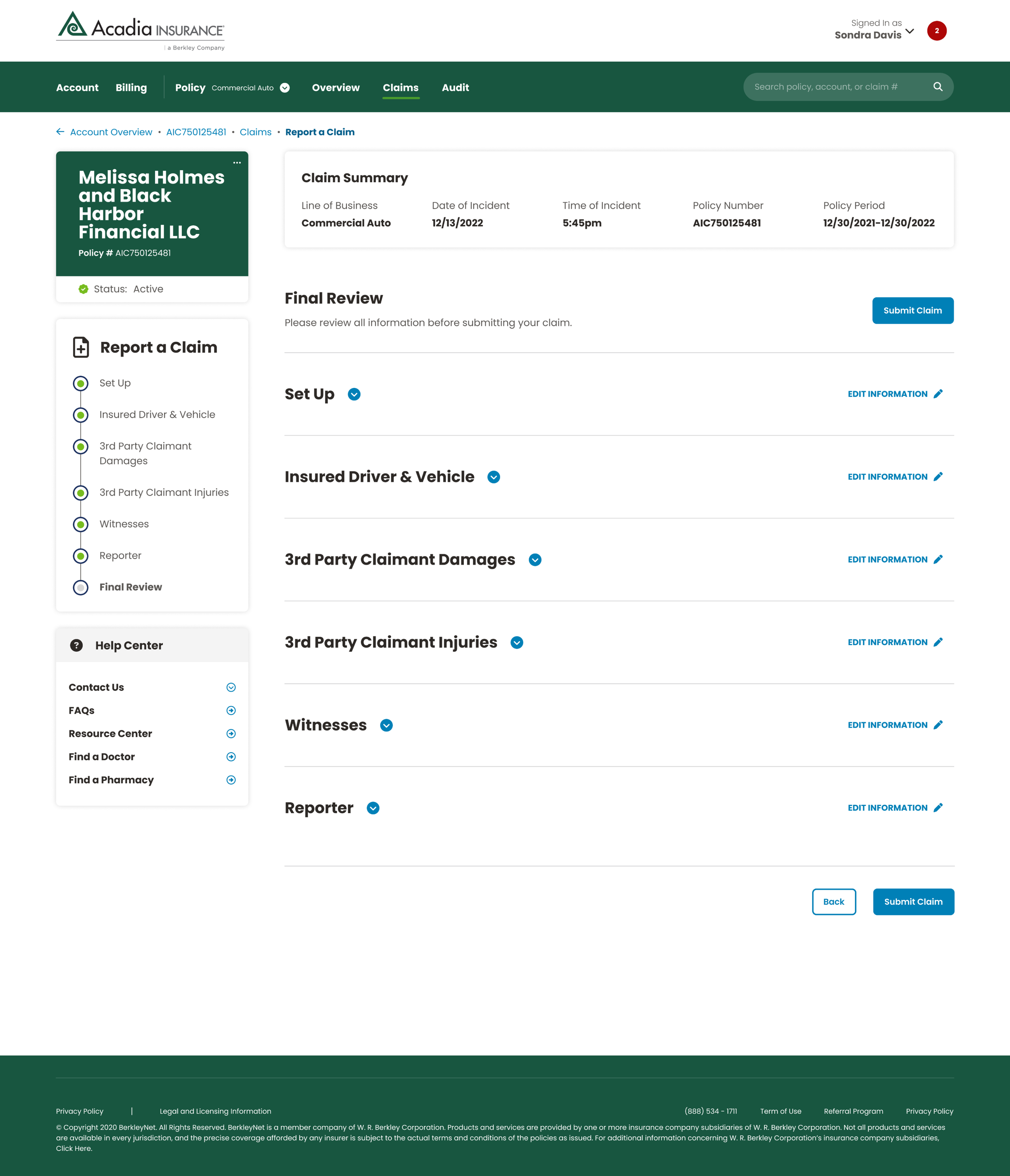
By working with the UI screens provided above, I was able to finalize the entire flow for the project, streamlining the process and ensuring a smooth user experience across all stages.
I took the existing format of Commercial Auto and transformed it into a progressive disclosure approach, breaking down the information into manageable steps to enhance usability and guide users more intuitively through the flow.
Feedback & findings
Usability & Accessibility
I initially struggled with spacing. I misunderstood component spacing hierarchy, which was evident in my work. I made sure to get a full grasp on it going forward after this project.
Business vs. User Needs
My designs met the criteria provided on Jira.
Once I was done with this project, I went through design reviews with the other designers on the team, fixed whatever feedback they gave me, and then passed it over to developers for production.
Final designs are shown above on desktop.


